Her/Their Clinic
CONCEPT DEVELOPMENT / BRAND IDENTITY / CAMPAIGN
A lot has changed since 1981 when the Women’s Health Clinic first began operation. Today with such a strong focus on being inclusive of different sexualities and gender expression, it was important to communicate Women’s Health Clinics evolution. It is essential that their inclusive views and beliefs be communicated clearly so all can benefit from their resources and support.
During the design process, it was important that the project was approached in a sensitive and intuitive manner. Presenting as a white female, I wanted to make sure that I approached this in the most respectful way, while using the skills learned in design to communicate a thoughtful and important message. This process included a lot of research and conversations with individuals regarding the concept as a whole.
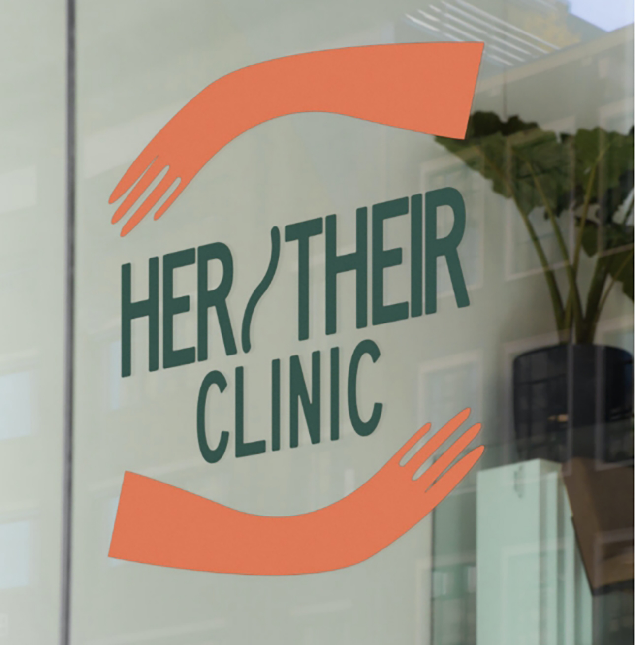
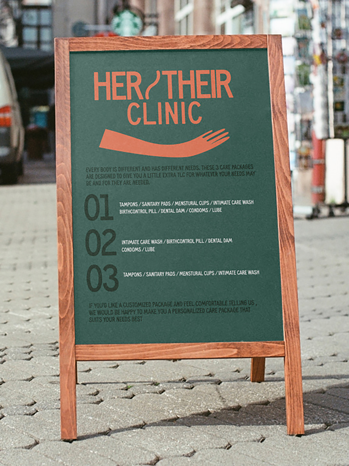
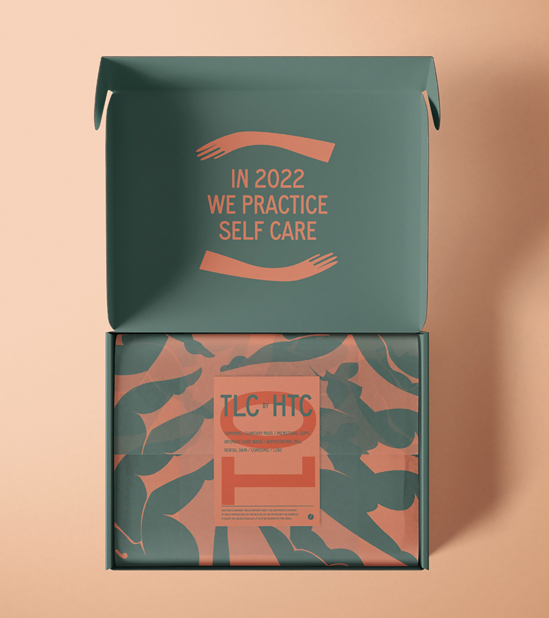
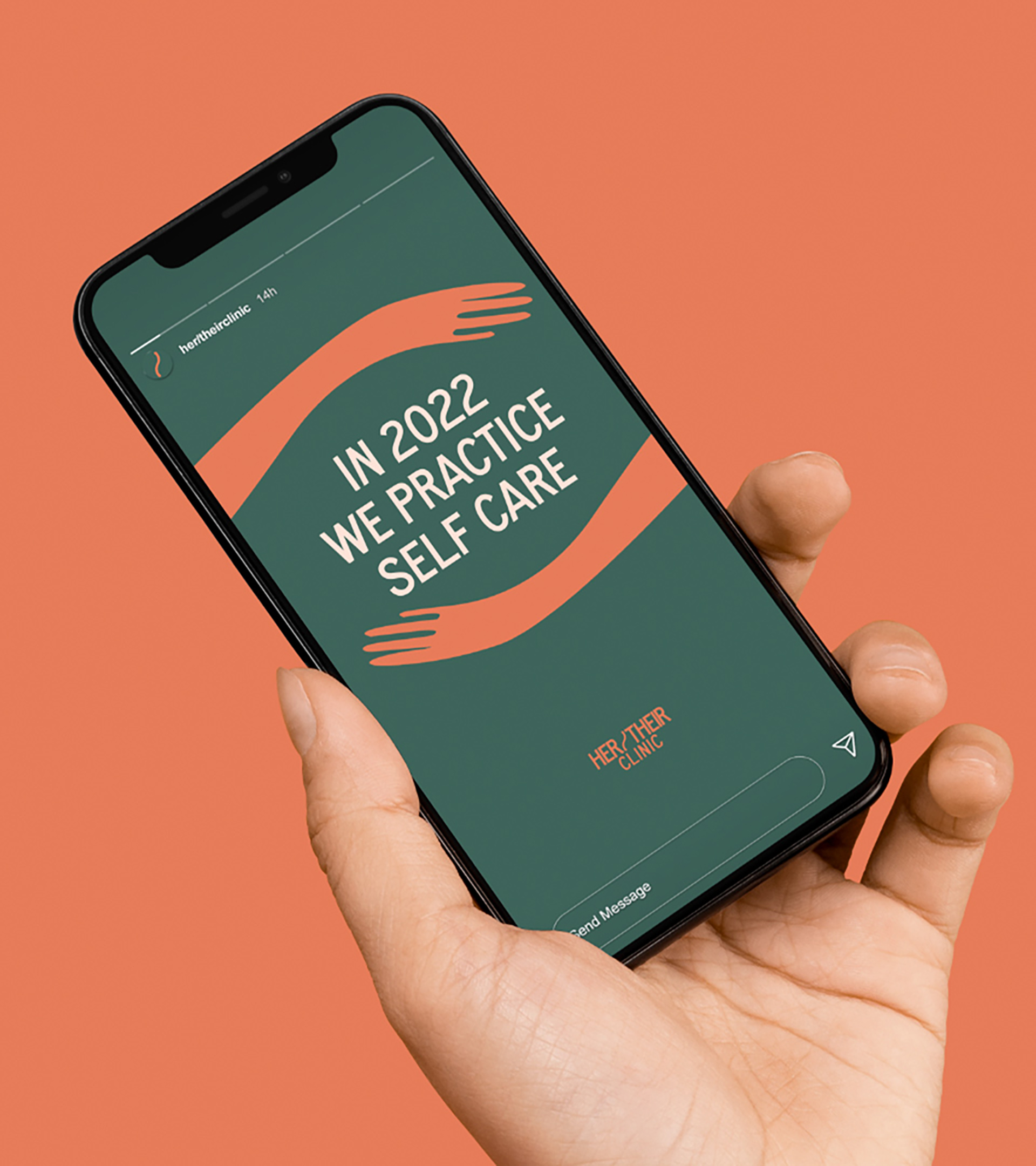
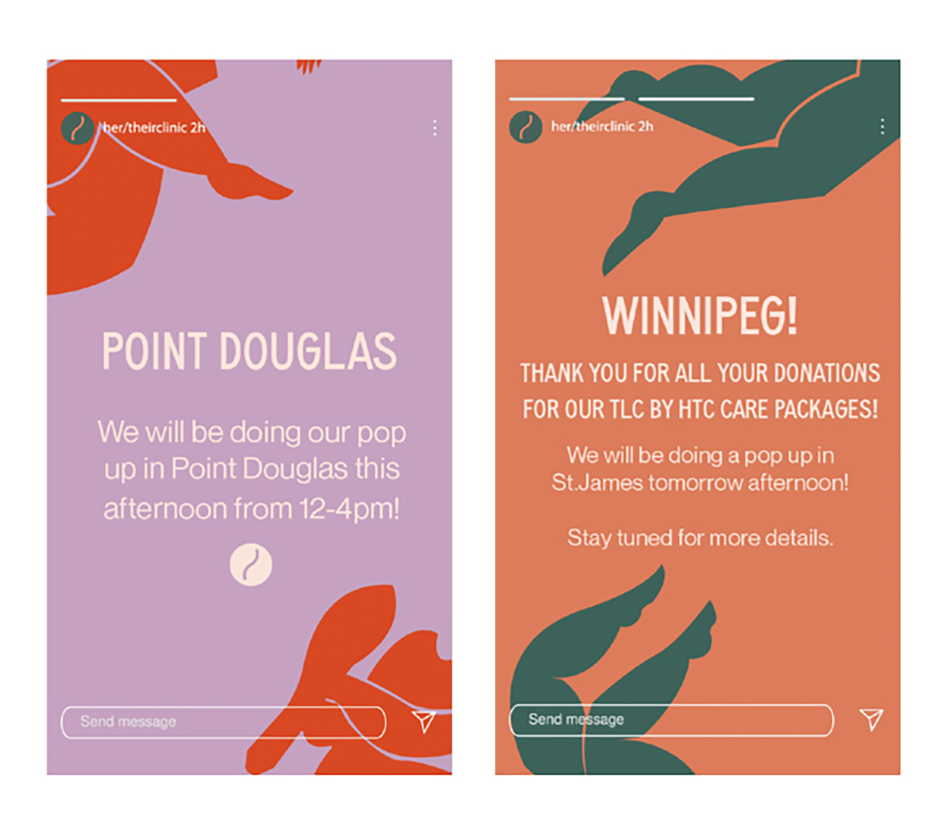
The solution to this was to create a new name altogether–Her/Their Clinic. With such a significant re-brand, it was important to communicate and promote this through a campaign.
The new brand word-mark identifies the organization’s core value–inclusivity. The shift from the word “women” to “her/their” reflects the clinic’s supportive inclusive views and values, while not taking away from the services they offer and the audience that it is intended for. As we become more educated on respectful terminology, this new name reflects that the clinic is open to learning and evolving to ensure that their target audience feels safe and respected. Her/Their communicates the identified pronouns of the audience this clinic is intended for.